Chart API Examples
What is it?
There are several charting APIs that provide code for making a range of charts and maps. The Google Charts API is one such platforms. With a little JavaScript and data knowledge, you can make them interactive and integrate into your sites.
Why should I learn it?
These examples will show you how you can add interactivity to charts by allowing users to input data or filtering with a dropdown.
What can I do with it?
Feel free to modify and customize any of these scripts for your own purposes.
How long will it take?
You already know all the JavaScript you need to be able to apply these concepts. Start incorporating charts, graphs and maps into your projects.
Resources
Getting Started
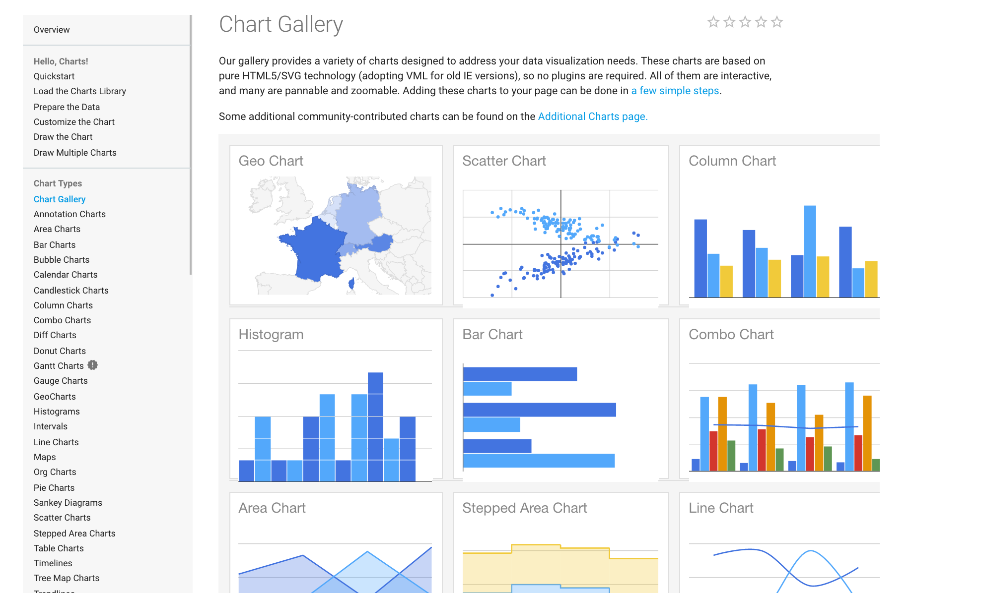
This isn't an exercise as much as it is a series of completed examples using some different Google Charts. I don't have step-by-step videos or instructions for these, but you should now be able to make changes to code for your own purposes. Put the code for each in an html file and open in a browser to see them in action. Look through the extensive Google Chart Gallery for ideas about charts you'd might be able to use.
Each chart needs the following code in the head of the document to connect to the Google Charts API:
In addition, the code needs to know what charting package to use. Pie, bar, column an and line charts are all part of the "core" package. Maps are part of the "map" package.
We also need to use the following code to indicate what happens when the page loads, which function should be called on load. Typically, a version of the chart is drawn when page loads, so that something is visible. However, if you don't want anything visible on load, this line can be eliminated.
Then you create the function that draws the chart. In these examples, the function is named drawChart(), but you can name it anything you want as long as that is how you call it. You call it in the form HTML with an appropriate event. For example:
Within the function, you use JavaScript to get the values from the form into your variables, either from direct input or via JSON. The arrayToDataTable includes the elements and variable names. The code ends with the declarations to create and draw the charts to the appropriate DOM element.
The examples below provide working code for various types of charts. The charts are now completely responsive. See note below first chart sample.
Pie Chart - Budget App
Google Charts can be used with JavaScript to pass values into charts based on user input. Using the Interactive App example from the More Interactive Examples module, we add a pie chart to display the percentages of each expense item. When the user submits the form, the inputs are converted to variables and the values associated with those variables populate the pie chart.
Budget Calculator
Pie Chart - Budget App
There are various styles that control how the form and chart display. But you can use any styles you want to create your desired layout on the page.
Pie Chart with Dropdown
This example shows how to change the data from JSON that is used in a pie chart based on a user's dropdown selection. This form uses an onchange event for when the dropdown is executed.
Each chart type includes various options that can be found in the Google Charts Gallery that can be used to customize the presentation. You can remove the legend by include "legend: {position: 'none'}" in the options (separate each line with a comma). And you can include a array of colors (color names or hexidecimal) under options to change the colors of the chart elements. See in code sample.
Using the Core chart package, youc an easily change the chart type in the visualization statement from PieChart to ColumnChart (horizontal bar presentation), BarChart (vertical bar presentation) or LineChart (best with date listed in date order). Choose the chart type that best corresponds to your data.
Pie Chart with Dropdown/JSON
Charts with Multiple Dimensions
This example demonstrates how to change a Bar Chart with JSON data with multiple variables based on the user's selection from a dropdown. This data could also be presented as Column or Line charts, but would not work with a pie chart, which is a one dimensional chart type.
If you want a chart with vertical bars, simply change the following line to request ColumnChart:
var chart = new google.visualization.ColumnChart(document.getElementById('div_chart'));
If you want a line chart, simply change the following line to request LineChart
var chart = new google.visualization.LineChart(document.getElementById('div_chart'));
BarChart, ColumnChart and LineChart are all part of the "core" package. Carefully consider which chart type is best for your data
Bar Chart with Multiple Dimensions
Google Map with Dropdown
Since Google now requires a billing account to use this map's API, we are no longer using in this class. Just review in the tutorial. You can provide location information to create a Google Map. This example shows how the map can also be filtered based on a user's dropdown selection. The map data is stored in origData, but the selection of the dropdown creates a newData array that is invoked for the map using the "push" function. We use this push approach because we don't know how many elements will be posted to the map for each selection. A for loop matches an element in each object of the array and creates the newData array.
If your map does not show when you upload to your domain, it is probably because you need a Google Maps API. You need to create one by going to the Google API Console and getting an API key. Set up a project for your site.
Your code will look something like this. Include it at the bottom of your html page.
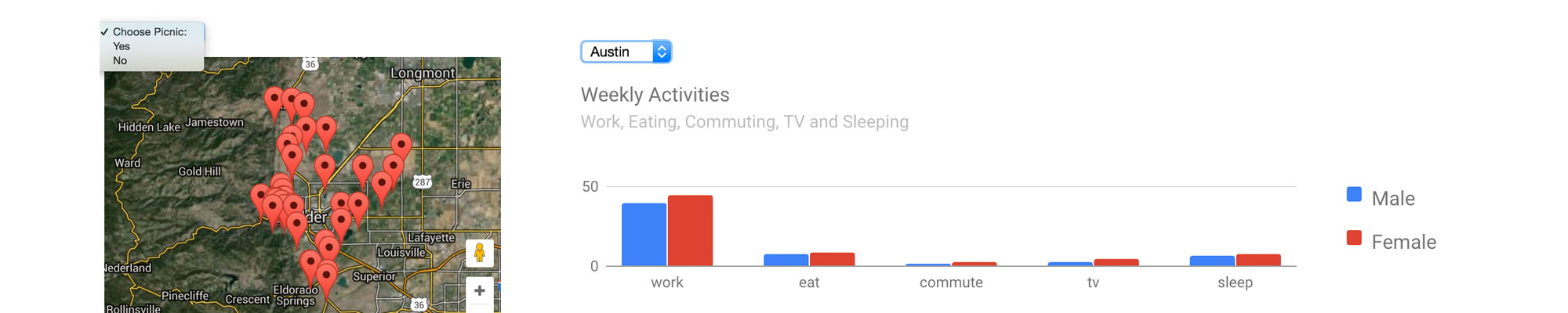
Search for trailheads with picnic locations.
Google Map with Dropdown
Google Map with Dropdown and Filtered Table
Since Google now requires a billing account to use this map's API, we are no longer using in this class. Just review in the tutorial. This example includes a filtered data table, which we will cover in more detail in the Filtering Large Datasets lesson. As above, the map data is stored in origData, but the selection of the dropdown creates a newData array that is invoked for the map.
If your map does not show when you upload to your domain, it is probably because you need a Google Maps API. You need to create one by going to the Google API Console and getting an API key. Set up a project for your site.
Your code will look something like this. Include it at the bottom of your html page.
Search for trailheads with picnic locations.
| Trailhead | Picnic: Yes or No |
|---|
Google Map with Dropdown and Filtered Data Set
GeoChart
This example shows a Google GeoChart, sometimes known as a Choropleth map. This is a map that allows comparison by region based on values. The following is a GeoChart of the US that allows the user to choose Population, Violent Crime per 100k or Property Crime per 100k. The data is included in a JSON section and a loop is used to populate the chart depending on the user's selection.
The data for this chart was obtained at the FBI's Crime Data Explorer. The Summary Data with Estimates was downloaded and opened in Excel, filtered for only 2017 data by state and selecting only state name, population, violent crime and property crime. I used a formula in Excel to convert the absolute violent crime and property crime data to be per 100,000 to create a relative comparison by state. The data was then copied and transposed in order to create a csv file with lines for the three measures with data for each state. The CSV data was converted to JSON and pulled into the file to be accessed by the loop.
Even though there is a lot of data here, don't be intimidated by this example. It is another demonstration of using a loop to identify JSON data.
2017 US State Population and Crime Per 100,000
Google GeoChart
Scatter Chart
A Scatter Chart allows you to plot distribution of two numeric variables. The code to the right provides an example of the distribution of student pre-test vs. post-test scores. The dropdown allows you to filter the chart by another variable, in this case gender. The code works by pushing the data into a newData table that matches the dropdown when the user changes the dropdown. The newData table is what is used to draw the chart. Each time the user changes the dropdown, a new chart is drawn. Think about what type of data would be appropriate to display in this manner for your own storytelling.
Code Sample - Scatter Chart
Bubble Chart
A Bubble Chart allows you to plot three numeric variables, one variable each on the horizontal and vertical axes and then a third numeric variable that determines the size of the bubbles. The example plots average GPA and 6-year graduation rate for different majors by schools (fictional for this example) when selected in dropdown. The code works by pushing the data into a newData table that matches the dropdown when the user changes the dropdown. The newData table is what is used to draw the chart. Each time the user changes the dropdown, a new chart is drawn. Think about what type of data would be appropriate to display in this manner for your own storytelling
Code Sample - Bubble Chart
Now You Try
See the code at the right. Find the appropriate code to create a line chart visualization that will place a line chart in the div named line_chart. Put that where indicated in the code. Then create the if statement where indicated to pull the data from the json into the chart.
Try a Line Chart
Using Multiple Charts on a Page
The above methods work great when you just have one chart on a page. But what if you wanted to use multiple charts on the same page? You must include the script references, the function and the html for the form and chart drawing elements in the appropriate places on the page. So, take your time and place the items in the proper areas. Then there are a few things that need to be adjusted to allow multiple charts to function on a page.
- The most important thing to change is the name of the function for each chart. Your code will get confused if you have multiple functions named drawChart, so go through and uniquely name each function.
- Your dropdowns need to have unique ids as well (remember, an id is only supposed to be used once on a page anyway), so the script won't get confused about which input should be used.
- Only need to load the packages line once, if you are using the same package, i.e. "corechart." If you are using multiple packages, i.e. "corechart" and "maps", you can include them on two separate lines or combine them as follows:
google.charts.load('current', {'packages':['corechart', 'map']});
- You need to set the callback for all the charts you want to draw when the site loads, so you can use multiple lines for these, as such.
google.charts.setOnLoadCallback(drawChart); google.charts.setOnLoadCallback(drawChart2);
- To make the charts responsive, you will include each drawChart function in the resize function
window.onresize = function() { drawChart(); drawChart2(); }
Of course, you want to use your Bootstrap skills to place these elements in a grid element to achieve your desired layout.
That's it. If you give the functions and dropdowns unique names, the script will find the proper JSON, data and chart options for that operation. As with any of these charts, you may need to adjust the styles or include them in their own divs to achieve your desired layout. But think carefully about what each part of the script is doing, and you will be able to use multiple charts on your pages.
Using Multiple Charts on a Page
Another Exercise
Find the JSON data to the right. It is Austin Housing Data by Zipcode found at the city's data portal. It includes Median Income, Median Home Value, and then percentages of units that different people can afford to either own or rent - Service/Retails Workers, Artists, Tech Workers. Make the following charts first on separate pages.
- Make a line chart that shows all zipcodes and allows you to chart between median income and median home value with a dropdown.
- Make a column chart that shows all zipcodes and allows you to see what percentage of units can be owned by each of the groups - service, artist, tech. User should choose Service, Artist and Tech from the dropdown.
- Make a column chart that shows all zipcodes and allows you to see what percentage of units can be rented by each of the groups - service, artist, tech. User should choose Service, Artist and Tech from the dropdown.
- Now make one column chart that shows both own and rent on the same chart (each zip code will display two columns instead of one
- Combine the 1st and last charts on one page. Make the necessary changes to the script to allow multiple charts to display.
Another Exercise
Moving On
All these exercises demonstrate practical use of the features we have discussed, this time incorporating the Google Maps library. Work on adding interactive features for charts, graphs and maps on your own sites.