
iPhone App Development - Layout and Constraints
What is it?
Swift is the current language for creating iPhone applications. It works within Apple's Interactive Development Environment (IDE) XCode. It is a combination of visual and programming interfaces.
Why should I learn it?
The world is mobile. While many content applications can function on phone browsers, there are some applications, like games, social media and ecommerce, that need native functionality.
What can I do with it?
You can create the visual interface as well as add code to represent functionality of your application using Swift and XCode. Then you can test and upload to Apple's App Store.
How long will it take?
Learning application development is a different and bit more difficult than creating websites. These tutorials will take several weeks to go through to explain the basic functionality available for application development. But with time and practice, you can master the skills necessary to create functional applications. Beyond iPhone development, there is native Android development and cross-platform options like React Native to consider.
Layout and Constraints
Now that you have had some experience with functionality, let’s talk a bit more about layout. We know that an app can be used on many different sized devices – different sized iphones or ipads. We want to use some techniques to make your design adapt to these sizes.
Find the alignment icons at the bottom of the XCode screen. See the image to the right.
Put a label or button the storyboard and give it a background color using the Attributes Inspector, so we can see it. We will use the Layout buttons to place, size and align objects. Hover over each icon and you will see its name.
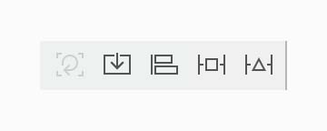
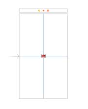
The third icon is the Align icon. You can use it to center an element vertically or horizontally. Try it on the element you added on the storyboard, by clicking the corresponding boxes. The numbers indicate an offset from center.
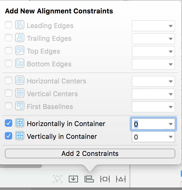
Notice the blue lines that were created to indicate the Constraints. If you click on the Size Inspector, you can see the Constraints that were added.
You can remove Constraints by clicking the lines and deleting or by deleting the items in the Constraints are of the Size Inspector. You can Clear All Constraints using the Resolve Auto Layout Issues button. Use the first button, Update Frames, to have the elements respond to the constraints.
Use the View As area below the Storyboard and change the orientation to see that the label remains centered, regardless of whether it is portrait or landscape.
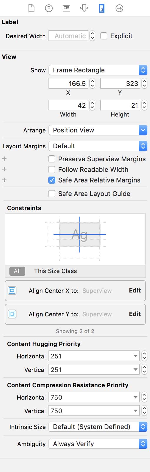
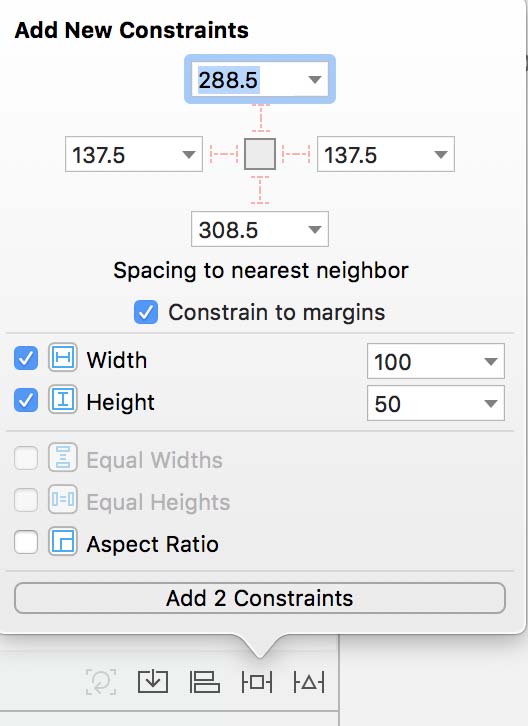
Use Add New Constraint button to adjust height and width of your element. When you click this button, notice the distance to the edges that was created when you centered. This is relative to the current device size.
This changes the size of the button. Sometimes adding Constraints causes conflicts. You may get a yellow exclamation point error or see red lines on the Storyboard. You can try to resolve conflicts using the fifth icon or by removing them from the Size Inspector.
If you move your centered item on the screen, this creates a conflict. If you click the first icon, the Update Frames icon, this will fix it and move the item back to the center.
Change the size of the device view to see your item remaining centered and sizing.
Stack View
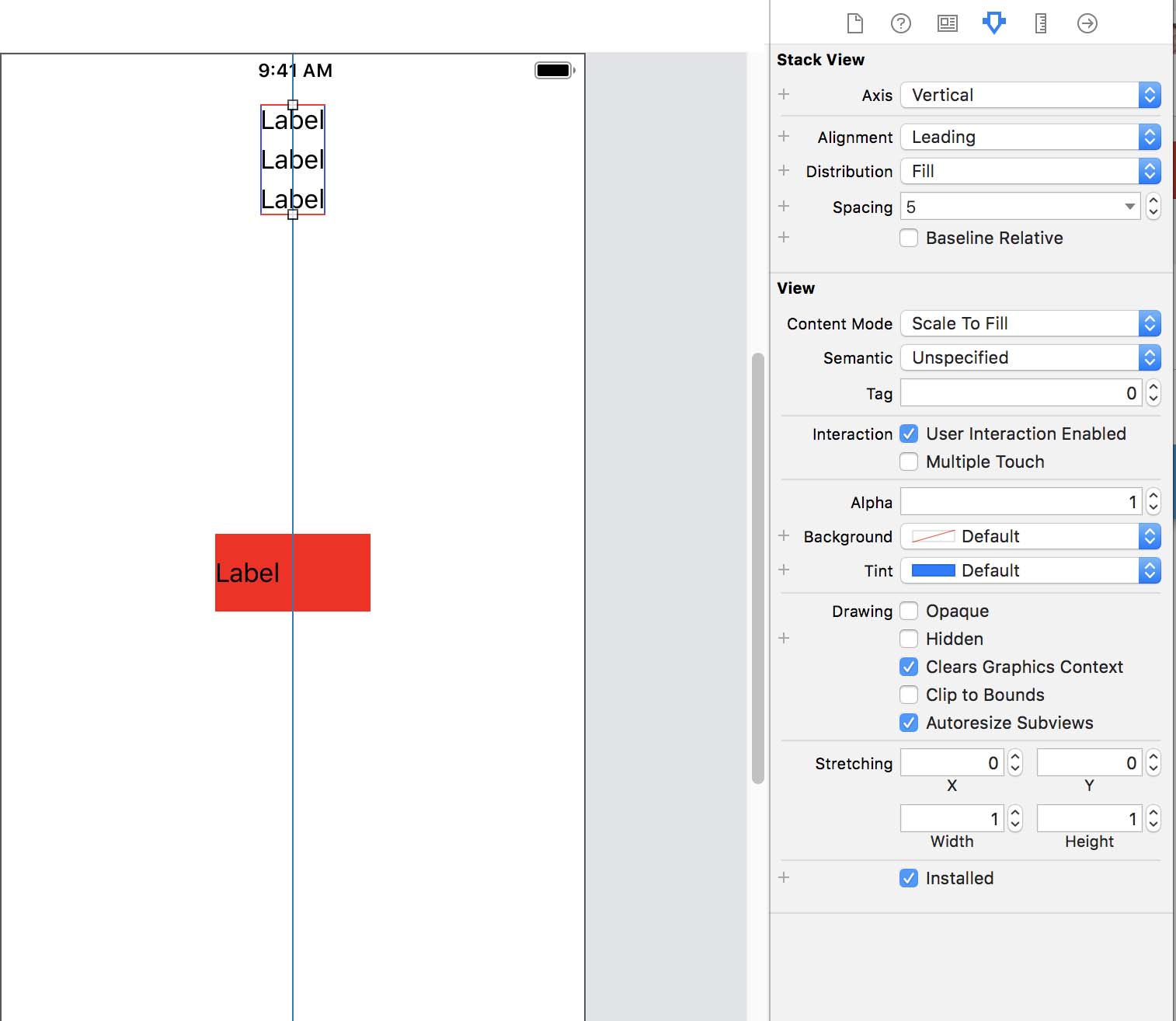
Use a Stack View to control spacing of elements in one View. Stack several labels at the top of the screen. Select them all and choose the Embed in Stack icon. Select the Stack View (might have to drag the mouse over it) and change Spacing in the Attributes Inspector (it will say Stack View at the top of the Attributes Inspector when you have correctly selected the Stack View). Play with the other attributes in this area.
Change the size of the device view to see your item remaining centered and sizing.
Layout for Images
Since images need to maintain their aspect ratio to appear properly, you can add a few constraints to them to size with the device.
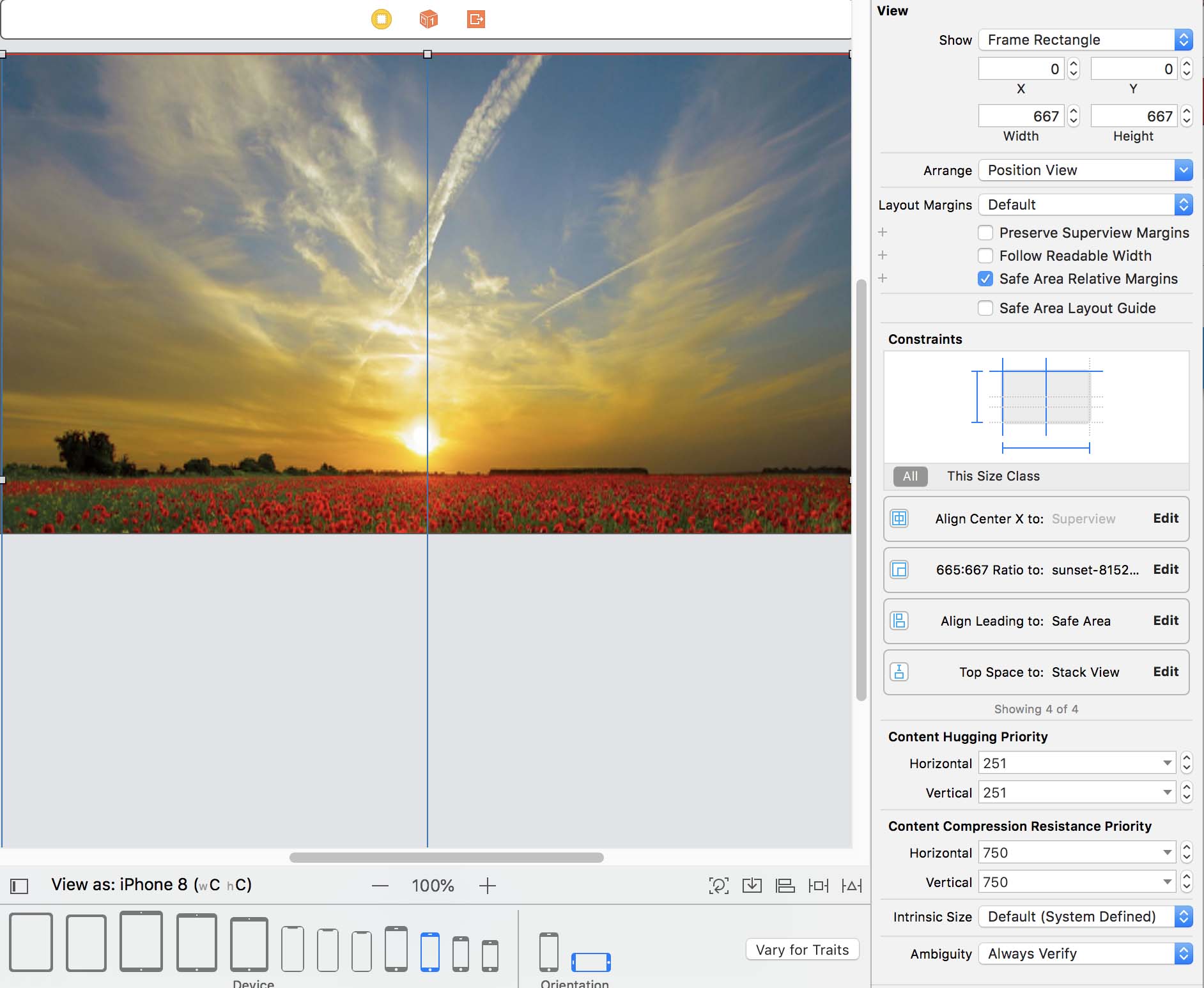
- For this first image, let’s use a large image that goes fully across the screen. Here's one you can use or download one of your own.
- Drag an ImageView to the storyboard and size it to fill the entire screen. Drag an image from the Finder into the assets folder. This allows you to upload different sized versions of the same image. Select this image in the Attributes Inspector for the ImageView.
- Establish the Aspect Ratio of the image. You can do this in the Add Constraints icon or by ctrl-click. Use the Align button to center the image horizontally. This will allow it to be place properly at portrait or landscape views.
- To resolve conflicts, you need to establish top and leading (left side) space. Do this with Add Constraints and make those items both 0.
- Now change the device you are viewing to different devices and orientations to see this working. You should also test by building it in various devices with the Simulator.
Now, let’s try one that the image will not be stretched across the screen. We can modify the Multiplier as a decimal. Remove the large image.
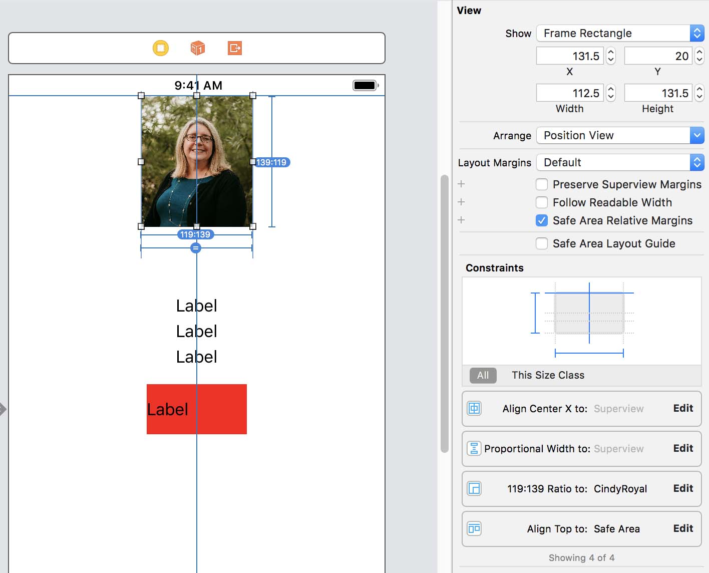
- Find an image, like a headshot and drag it to the assets folder. Here's one you can use or download another. Move it to an ImageView. We want to do the same steps as above, except changing the Multiplier for Equal Widths to 0.30 and only establishing the top spacing.
- First establish the Aspect Ratio of the image. You can do this in the Add Constraints icon or by ctrl-click and drag from the image to itself and picking Aspect Ratio.
- Next, ctrl-click on the image and drag to the storyboard. Here you want to select Equal Widths. In this case, the width multiplier will remain 0.30. You can change this by editing the constraint in the Constraint inspector.
- Use the Align icon to Horizontally Align the image.
- To resolve conflicts, you need to establish top space. Do this with Add Constraints and make 0.
Try it and test it at different device sizes. You should be able to change the device sizes and see how the image looks. It should be centered at the top and taking up 0.30 of the space.s
Moving On
Take your time with these techniques. They will help you achieve more professional and responsive designs! Next, we'll move into more complex app functionality.